
Spalding Packaging Re-design
Spalding Packaging Re-design
Spalding Packaging Re-design
CLIENT:
CLIENT:
Spalding Product Marketing
Spalding Product Marketing
Spalding Product Marketing
SCOPE:
SCOPE:
Package Design
Package Design
Package Design
Image Manipulation & Retouching
Image Manipulation & Retouching
Image Manipulation & Retouching
3D Mockups & Renderings
3D Mockups & Renderings
3D Mockups & Renderings
01 The Challenge
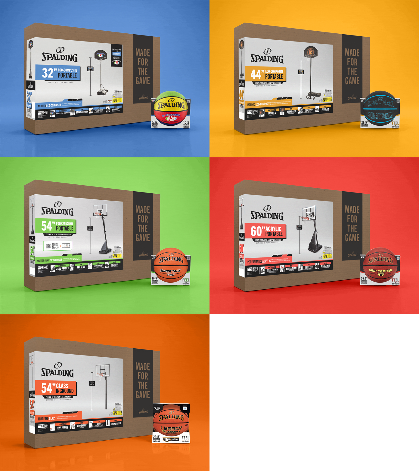
Spalding had recently undergone a brand strategy update and needed a new packaging system to bring the refreshed brand to life. Years of incremental updates had resulted in multiple package designs across domestic and international markets, resulting in a fragmented brand experience. Tasked by our marketing team to update our whole fleet of inflate, hoop, and accessory packages, we had a massive task ahead.
01 The Challenge
Spalding had recently undergone a brand strategy update and needed a new packaging system to bring the refreshed brand to life. Years of incremental updates had resulted in multiple package designs across domestic and international markets, resulting in a fragmented brand experience. Tasked by our marketing team to update our whole fleet of inflate, hoop, and accessory packages, we had a massive task ahead.
01 The Challenge
Spalding had recently undergone a brand strategy update and needed a new packaging system to bring the refreshed brand to life. Years of incremental updates had resulted in multiple package designs across domestic and international markets, resulting in a fragmented brand experience. Tasked by our marketing team to update our whole fleet of inflate, hoop, and accessory packages, we had a massive task ahead.
01 The Challenge
Spalding had recently undergone a brand strategy update and needed a new packaging system to bring the refreshed brand to life. Years of incremental updates had resulted in multiple package designs across domestic and international markets, resulting in a fragmented brand experience. Tasked by our marketing team to update our whole fleet of inflate, hoop, and accessory packages, we had a massive task ahead.


File Optimization

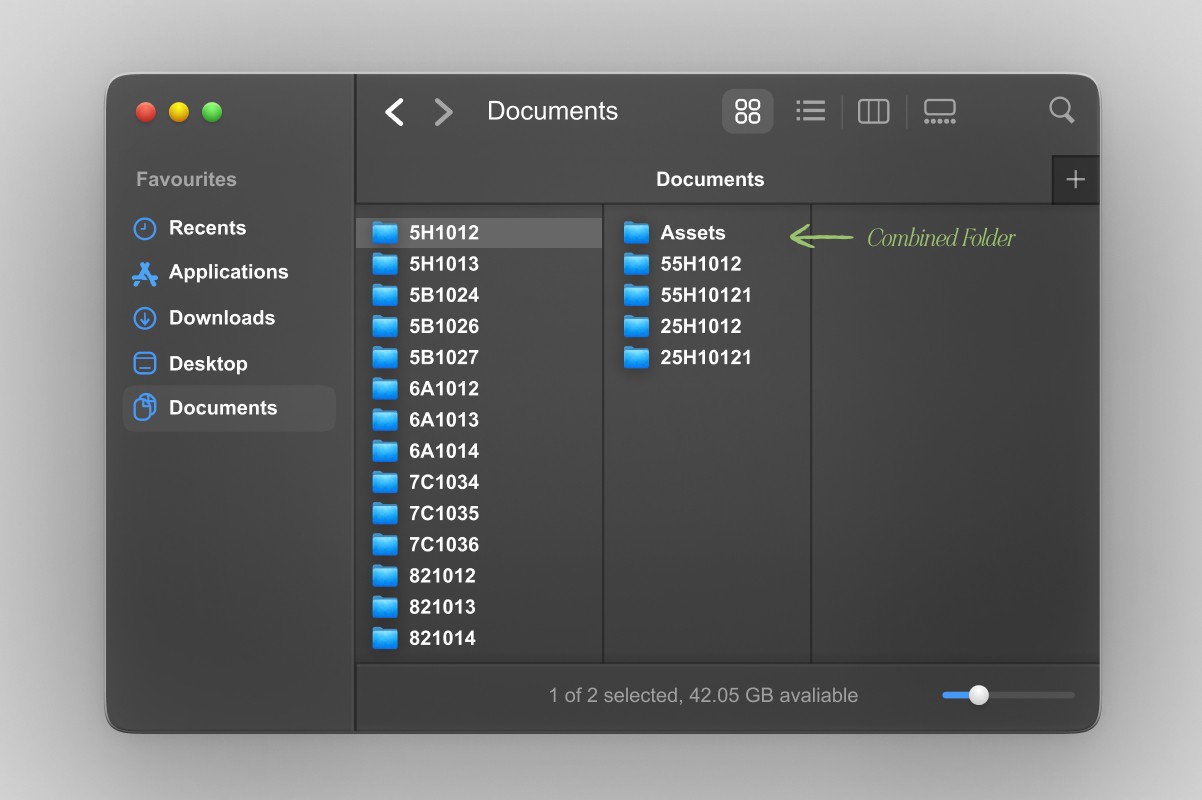
The packaging redesign was also an opportunity to address a major organizational challenge behind the scenes. Packaging files had accumulated over the years with no consistent file structure, with artists organizing files by their item number, version number, or individual preference. With multiple iterations and regional adaptations, finding the correct artwork, or even the knowing which file was the most current, had become increasingly difficult. I developed a more intuitive file organization system that standardized naming, folder structure, and versioning across the packaging library. This made files easier to locate, reduced confusion around final artwork, and created a more scalable system for managing packaging across product lines and markets.
File Optimization
The packaging redesign was also an opportunity to address a major organizational challenge behind the scenes. Packaging files had accumulated over the years with no consistent file structure, with artists organizing files by their item number, version number, or individual preference. With multiple iterations and regional adaptations, finding the correct artwork, or even the knowing which file was the most current, had become increasingly difficult. I developed a more intuitive file organization system that standardized naming, folder structure, and versioning across the packaging library. This made files easier to locate, reduced confusion around final artwork, and created a more scalable system for managing packaging across product lines and markets.
File Optimization
The packaging redesign was also an opportunity to address a major organizational challenge behind the scenes. Packaging files had accumulated over the years with no consistent file structure, with artists organizing files by their item number, version number, or individual preference. With multiple iterations and regional adaptations, finding the correct artwork, or even the knowing which file was the most current, had become increasingly difficult. I developed a more intuitive file organization system that standardized naming, folder structure, and versioning across the packaging library. This made files easier to locate, reduced confusion around final artwork, and created a more scalable system for managing packaging across product lines and markets.
File Optimization
The packaging redesign was also an opportunity to address a major organizational challenge behind the scenes. Packaging files had accumulated over the years with no consistent file structure, with artists organizing files by their item number, version number, or individual preference. With multiple iterations and regional adaptations, finding the correct artwork, or even the knowing which file was the most current, had become increasingly difficult. I developed a more intuitive file organization system that standardized naming, folder structure, and versioning across the packaging library. This made files easier to locate, reduced confusion around final artwork, and created a more scalable system for managing packaging across product lines and markets.
02 Starting Point
The new packaging strategy centered on four key shifts: brighter layouts, focused product imagery, a clearer color hierarchy, and simplified information. Together these changes created a more modern retail presence while making the packaging easier to navigate. Modern,Simplified Design: We moved away from the darker backgrounds used across previous packaging. On hoop packaging, a neutral gray color allowed the entire hoop (even the backboard art) to remain visible. For inflates, a high-contrast white and black combination palette brightened the entire package and helped the product stand out on the shelf. Color Hierarchy: We modernized the packaging’s color hierarchy to align with the updated brand strategy and introduced a coordinated color system across products.
02 Starting Point
The new packaging strategy centered on four key shifts: brighter layouts, focused product imagery, a clearer color hierarchy, and simplified information. Together these changes created a more modern retail presence while making the packaging easier to navigate. Modern,Simplified Design: We moved away from the darker backgrounds used across previous packaging. On hoop packaging, a neutral gray color allowed the entire hoop (even the backboard art) to remain visible. For inflates, a high-contrast white and black combination palette brightened the entire package and helped the product stand out on the shelf. Color Hierarchy: We modernized the packaging’s color hierarchy to align with the updated brand strategy and introduced a coordinated color system across products.
02 Starting Point
The new packaging strategy centered on four key shifts: brighter layouts, focused product imagery, a clearer color hierarchy, and simplified information. Together these changes created a more modern retail presence while making the packaging easier to navigate. Modern,Simplified Design: We moved away from the darker backgrounds used across previous packaging. On hoop packaging, a neutral gray color allowed the entire hoop (even the backboard art) to remain visible. For inflates, a high-contrast white and black combination palette brightened the entire package and helped the product stand out on the shelf. Color Hierarchy: We modernized the packaging’s color hierarchy to align with the updated brand strategy and introduced a coordinated color system across products.
02 Starting Point
The new packaging strategy centered on four key shifts: brighter layouts, focused product imagery, a clearer color hierarchy, and simplified information. Together these changes created a more modern retail presence while making the packaging easier to navigate. Modern,Simplified Design: We moved away from the darker backgrounds used across previous packaging. On hoop packaging, a neutral gray color allowed the entire hoop (even the backboard art) to remain visible. For inflates, a high-contrast white and black combination palette brightened the entire package and helped the product stand out on the shelf. Color Hierarchy: We modernized the packaging’s color hierarchy to align with the updated brand strategy and introduced a coordinated color system across products.


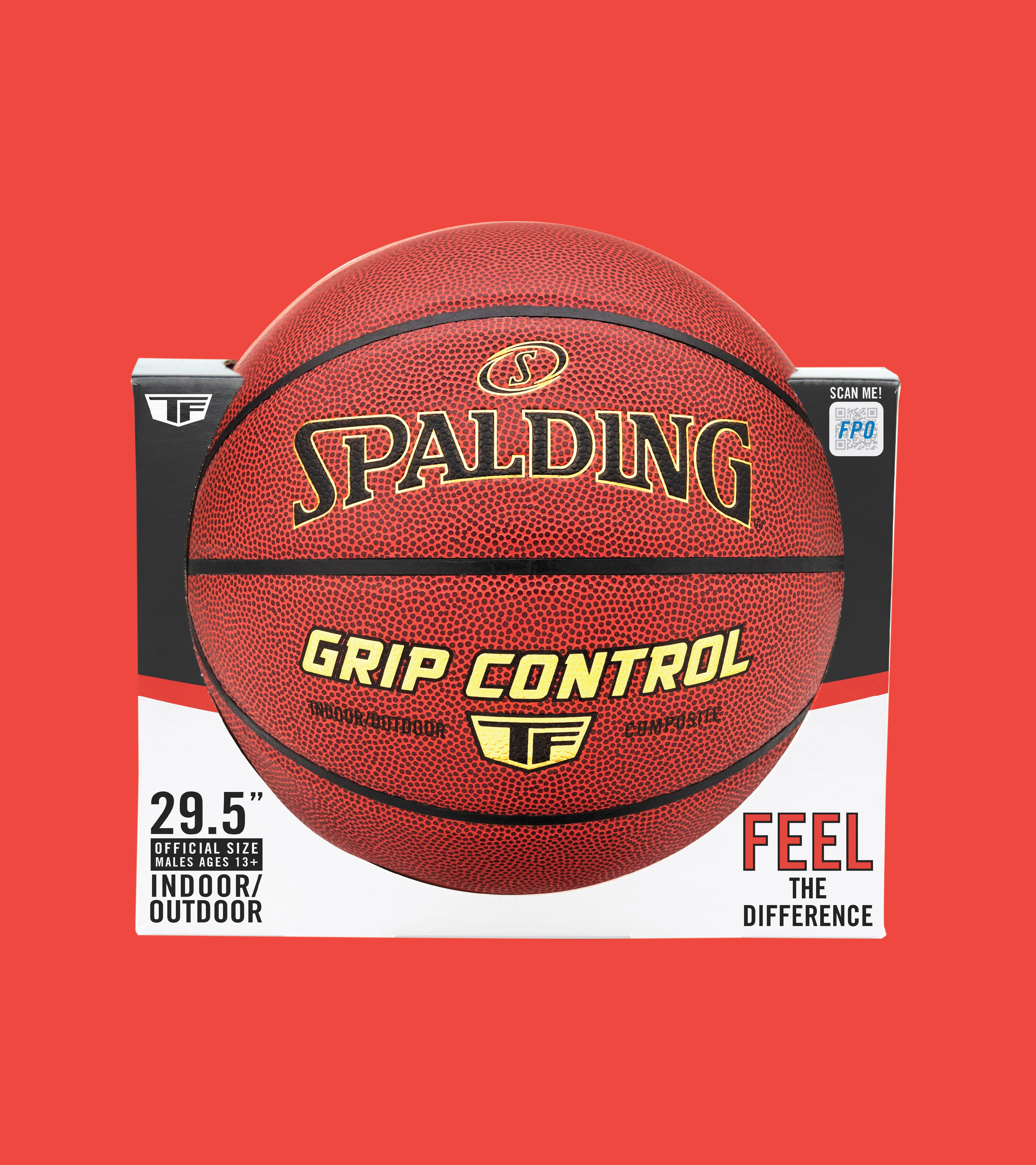

Simplified Copy: We reduced secondary copy and removed unnecessary information to make the most important technical details easier to find. For inflate packaging, customer research showed that shoppers often overlooked copy placed on the sides of the packaging. In response, we reduced the amount of side-panel copy and shifted the information into a more visual, scannable format. Focused Imagery: We focused on clean, enlarged studio photography that put the product front and center, eliminating background distractions and giving the hoop more visual impact.
Simplified Copy: We reduced secondary copy and removed unnecessary information to make the most important technical details easier to find. For inflate packaging, customer research showed that shoppers often overlooked copy placed on the sides of the packaging. In response, we reduced the amount of side-panel copy and shifted the information into a more visual, scannable format. Focused Imagery: We focused on clean, enlarged studio photography that put the product front and center, eliminating background distractions and giving the hoop more visual impact.
Simplified Copy: We reduced secondary copy and removed unnecessary information to make the most important technical details easier to find. For inflate packaging, customer research showed that shoppers often overlooked copy placed on the sides of the packaging. In response, we reduced the amount of side-panel copy and shifted the information into a more visual, scannable format. Focused Imagery: We focused on clean, enlarged studio photography that put the product front and center, eliminating background distractions and giving the hoop more visual impact.
Simplified Copy: We reduced secondary copy and removed unnecessary information to make the most important technical details easier to find. For inflate packaging, customer research showed that shoppers often overlooked copy placed on the sides of the packaging. In response, we reduced the amount of side-panel copy and shifted the information into a more visual, scannable format. Focused Imagery: We focused on clean, enlarged studio photography that put the product front and center, eliminating background distractions and giving the hoop more visual impact.


What's Next?

Spalding: POP
Spalding: POP
Spalding: POP
What's Next?
Spalding: POP
Spalding: POP
Spalding: POP
What's Next?
Spalding: POP
Spalding: POP
Spalding: POP
What's Next?