
Spalding Packaging Redesign
Spalding Packaging Redesign
Spalding Packaging Redesign
CLIENT:
CLIENT:
Spalding Product Marketing
Spalding Product Marketing
Spalding Product Marketing
SCOPE:
SCOPE:
Package Design
Package Design
Package Design
Image Manipulation & Retouching
Image Manipulation & Retouching
Image Manipulation & Retouching
3D Mockups & Renderings
3D Mockups & Renderings
3D Mockups & Renderings

01 The Challenge
Spalding had recently undergone a brand strategy update and needed a new packaging system to bring the refreshed brand to life. Years of incremental updates had resulted in multiple package designs across domestic and international markets, resulting in a fragmented brand experience. Tasked by our marketing team to update our whole fleet of inflate, hoop, and accessory packages, we had a massive task ahead.
01 The Challenge
Spalding had recently undergone a brand strategy update and needed a new packaging system to bring the refreshed brand to life. Years of incremental updates had resulted in multiple package designs across domestic and international markets, resulting in a fragmented brand experience. Tasked by our marketing team to update our whole fleet of inflate, hoop, and accessory packages, we had a massive task ahead.
01 The Challenge
Spalding had recently undergone a brand strategy update and needed a new packaging system to bring the refreshed brand to life. Years of incremental updates had resulted in multiple package designs across domestic and international markets, resulting in a fragmented brand experience. Tasked by our marketing team to update our whole fleet of inflate, hoop, and accessory packages, we had a massive task ahead.
01 The Challenge
Spalding had recently undergone a brand strategy update and needed a new packaging system to bring the refreshed brand to life. Years of incremental updates had resulted in multiple package designs across domestic and international markets, resulting in a fragmented brand experience. Tasked by our marketing team to update our whole fleet of inflate, hoop, and accessory packages, we had a massive task ahead.


02 Starting Point
The new packaging strategy centered on four key shifts: brighter layouts, focused product imagery, a clearer color hierarchy, and simplified information. Together these changes created a more modern retail presence while making the packaging easier to navigate. Modern,Simplified Design: We moved away from the darker backgrounds used across previous packaging. On hoop packaging, a neutral gray color allowed the entire hoop (even the backboard art) to remain visible. For inflates, a high-contrast white and black combination palette brightened the entire package and helped the product stand out on the shelf. Color Hierarchy: We modernized the packaging’s color hierarchy to align with the updated brand strategy and introduced a coordinated color system across products.
02 Starting Point
The new packaging strategy centered on four key shifts: brighter layouts, focused product imagery, a clearer color hierarchy, and simplified information. Together these changes created a more modern retail presence while making the packaging easier to navigate. Modern,Simplified Design: We moved away from the darker backgrounds used across previous packaging. On hoop packaging, a neutral gray color allowed the entire hoop (even the backboard art) to remain visible. For inflates, a high-contrast white and black combination palette brightened the entire package and helped the product stand out on the shelf. Color Hierarchy: We modernized the packaging’s color hierarchy to align with the updated brand strategy and introduced a coordinated color system across products.
02 Starting Point
The new packaging strategy centered on four key shifts: brighter layouts, focused product imagery, a clearer color hierarchy, and simplified information. Together these changes created a more modern retail presence while making the packaging easier to navigate. Modern,Simplified Design: We moved away from the darker backgrounds used across previous packaging. On hoop packaging, a neutral gray color allowed the entire hoop (even the backboard art) to remain visible. For inflates, a high-contrast white and black combination palette brightened the entire package and helped the product stand out on the shelf. Color Hierarchy: We modernized the packaging’s color hierarchy to align with the updated brand strategy and introduced a coordinated color system across products.
02 Starting Point
The new packaging strategy centered on four key shifts: brighter layouts, focused product imagery, a clearer color hierarchy, and simplified information. Together these changes created a more modern retail presence while making the packaging easier to navigate. Modern,Simplified Design: We moved away from the darker backgrounds used across previous packaging. On hoop packaging, a neutral gray color allowed the entire hoop (even the backboard art) to remain visible. For inflates, a high-contrast white and black combination palette brightened the entire package and helped the product stand out on the shelf. Color Hierarchy: We modernized the packaging’s color hierarchy to align with the updated brand strategy and introduced a coordinated color system across products.
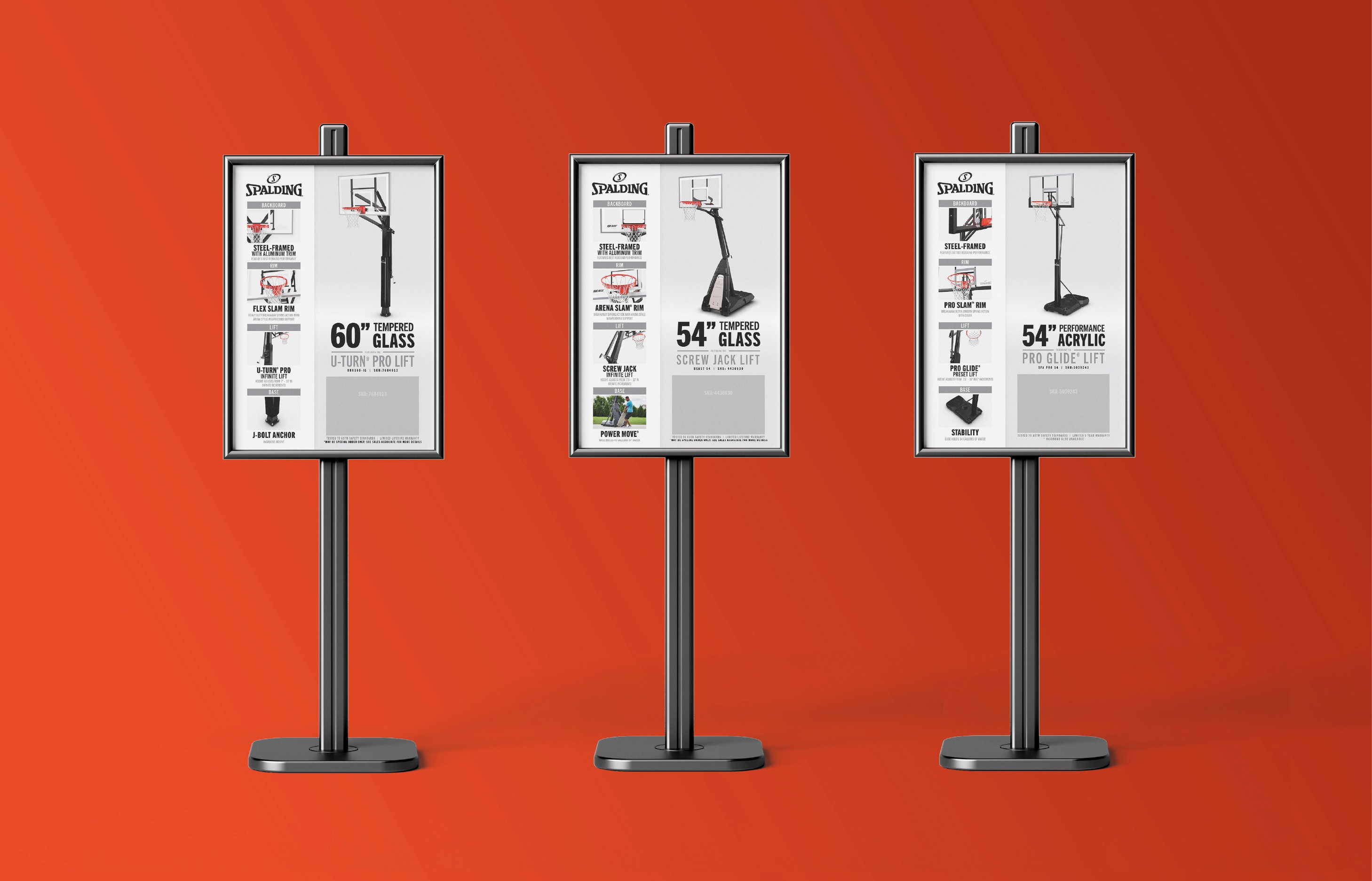


The new packaging strategy centered on four key shifts: brighter layouts, focused product imagery, a clearer color hierarchy, and simplified information. Together these changes created a more modern retail presence while making the packaging easier to navigate. Modern,Simplified Design: We moved away from the darker backgrounds used across previous packaging. On hoop packaging, a neutral gray color allowed the entire hoop (even the backboard art) to remain visible. For inflates, a high-contrast white and black combination palette brightened the entire package and helped the product stand out on the shelf. Color Hierarchy: We modernized the packaging’s color hierarchy to align with the updated brand strategy and introduced a coordinated color system across products.
The new packaging strategy centered on four key shifts: brighter layouts, focused product imagery, a clearer color hierarchy, and simplified information. Together these changes created a more modern retail presence while making the packaging easier to navigate. Modern,Simplified Design: We moved away from the darker backgrounds used across previous packaging. On hoop packaging, a neutral gray color allowed the entire hoop (even the backboard art) to remain visible. For inflates, a high-contrast white and black combination palette brightened the entire package and helped the product stand out on the shelf. Color Hierarchy: We modernized the packaging’s color hierarchy to align with the updated brand strategy and introduced a coordinated color system across products.
The new packaging strategy centered on four key shifts: brighter layouts, focused product imagery, a clearer color hierarchy, and simplified information. Together these changes created a more modern retail presence while making the packaging easier to navigate. Modern,Simplified Design: We moved away from the darker backgrounds used across previous packaging. On hoop packaging, a neutral gray color allowed the entire hoop (even the backboard art) to remain visible. For inflates, a high-contrast white and black combination palette brightened the entire package and helped the product stand out on the shelf. Color Hierarchy: We modernized the packaging’s color hierarchy to align with the updated brand strategy and introduced a coordinated color system across products.
The new packaging strategy centered on four key shifts: brighter layouts, focused product imagery, a clearer color hierarchy, and simplified information. Together these changes created a more modern retail presence while making the packaging easier to navigate. Modern,Simplified Design: We moved away from the darker backgrounds used across previous packaging. On hoop packaging, a neutral gray color allowed the entire hoop (even the backboard art) to remain visible. For inflates, a high-contrast white and black combination palette brightened the entire package and helped the product stand out on the shelf. Color Hierarchy: We modernized the packaging’s color hierarchy to align with the updated brand strategy and introduced a coordinated color system across products.


What's Next?

Spalding: POP
Spalding: POP
Spalding: POP
What's Next?
Spalding: POP
Spalding: POP
Spalding: POP
What's Next?
Spalding: POP
Spalding: POP
Spalding: POP
What's Next?