
JERZEES: Email Design
JERZEES: Email Design
JERZEES: Email Design
CLIENT:
CLIENT:
JERZEES Brand Communication Team
JERZEES Brand Communication Team
JERZEES Brand Communication Team
SCOPE:
SCOPE:
Image Manipulation & Retouching
Image Manipulation & Retouching
Image Manipulation & Retouching
JERZEES manufactures apparel for the garment decorating industry, from Tees to Fleece to Joggers.
JERZEES manufactures apparel for the garment decorating industry, from Tees to Fleece to Joggers.
JERZEES manufactures apparel for the garment decorating industry, from Tees to Fleece to Joggers.
01 The Challenge
Aligning the Look with the Brand Vision
JERZEES needed an updated visual look for email. The existing design leaned heavily into a corporate style that didn’t align with our “Endless Possibilities” campaign. The campaign encouraged self-expression and creativity, showcasing the many ways our products could be transformed through garment decoration. Our email design told a different story. Rigid Grids. Square Layouts. Heavy copy. A limited color palette. Emails felt structured and predictable, while our campaign was all about possibility.
01 The Challenge
Aligning the Look with the Brand Vision
JERZEES needed an updated visual look for email. The existing design leaned heavily into a corporate style that didn’t align with our “Endless Possibilities” campaign. The campaign encouraged self-expression and creativity, showcasing the many ways our products could be transformed through garment decoration. Our email design told a different story. Rigid Grids. Square Layouts. Heavy copy. A limited color palette. Emails felt structured and predictable, while our campaign was all about possibility.
01 The Challenge
Aligning the Look with the Brand Vision
JERZEES needed an updated visual look for email. The existing design leaned heavily into a corporate style that didn’t align with our “Endless Possibilities” campaign. The campaign encouraged self-expression and creativity, showcasing the many ways our products could be transformed through garment decoration. Our email design told a different story. Rigid Grids. Square Layouts. Heavy copy. A limited color palette. Emails felt structured and predictable, while our campaign was all about possibility.
01 The Challenge
Aligning the Look with the Brand Vision
JERZEES needed an updated visual look for email. The existing design leaned heavily into a corporate style that didn’t align with our “Endless Possibilities” campaign. The campaign encouraged self-expression and creativity, showcasing the many ways our products could be transformed through garment decoration. Our email design told a different story. Rigid Grids. Square Layouts. Heavy copy. A limited color palette. Emails felt structured and predictable, while our campaign was all about possibility.


03 Exploration
Adding the Personality
Once we opened up the color palette and layout, we began exploring ways to make the emails feel more expressive. Texture: Artistic textures and imperfect, hand drawn elements added personality and movement. Decoration: Rather than only highlighting blank products, the customer became part of our visual story as we incorporated more decorated pieces into the layout. This shifted our focus from what we sell to what our customers can create.
03 Exploration
Adding the Personality
Once we opened up the color palette and layout, we began exploring ways to make the emails feel more expressive. Texture: Artistic textures and imperfect, hand drawn elements added personality and movement. Decoration: Rather than only highlighting blank products, the customer became part of our visual story as we incorporated more decorated pieces into the layout. This shifted our focus from what we sell to what our customers can create.
03 Exploration
Adding the Personality
Once we opened up the color palette and layout, we began exploring ways to make the emails feel more expressive. Texture: Artistic textures and imperfect, hand drawn elements added personality and movement. Decoration: Rather than only highlighting blank products, the customer became part of our visual story as we incorporated more decorated pieces into the layout. This shifted our focus from what we sell to what our customers can create.
03 Exploration
Adding the Personality
Once we opened up the color palette and layout, we began exploring ways to make the emails feel more expressive. Texture: Artistic textures and imperfect, hand drawn elements added personality and movement. Decoration: Rather than only highlighting blank products, the customer became part of our visual story as we incorporated more decorated pieces into the layout. This shifted our focus from what we sell to what our customers can create.

04 The New Style
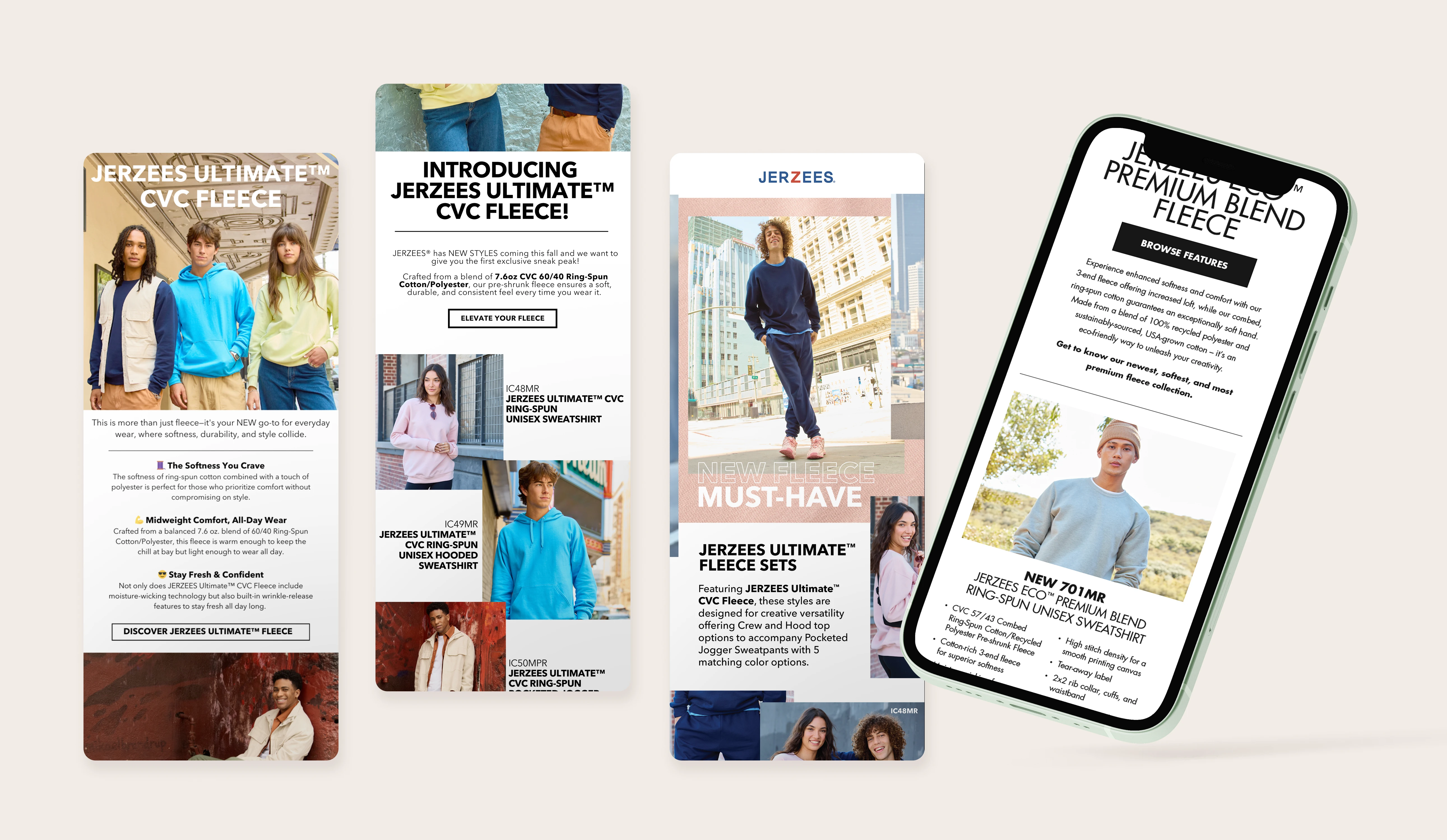
Before: Square. Text Heavy. Inconsistent. After: Editorial. Expressive. Intentional.
The new approach created a more dynamic email system that could flex with different products, campaigns, promotions, and stories. The result was an email experience that reflected the creativity of our customers and the “Endless Possibilitiez” they could create.
04 The New Style
Before: Square. Text Heavy. Inconsistent. After: Editorial. Expressive. Intentional.
The new approach created a more dynamic email system that could flex with different products, campaigns, promotions, and stories. The result was an email experience that reflected the creativity of our customers and the “Endless Possibilitiez” they could create.
04 The New Style
Before: Square. Text Heavy. Inconsistent. After: Editorial. Expressive. Intentional.
The new approach created a more dynamic email system that could flex with different products, campaigns, promotions, and stories. The result was an email experience that reflected the creativity of our customers and the “Endless Possibilitiez” they could create.
04 The New Style
Before: Square. Text Heavy. Inconsistent. After: Editorial. Expressive. Intentional.
The new approach created a more dynamic email system that could flex with different products, campaigns, promotions, and stories. The result was an email experience that reflected the creativity of our customers and the “Endless Possibilitiez” they could create.


05 Building a System
Beyond the Inbox
This new email direction became more than an email redesign. We shared this system with our social media agency to create greater continuity and the same visual thinking influenced our Swatch Card + Catalog and trade show presence.
05 Building a System
Beyond the Inbox
This new email direction became more than an email redesign. We shared this system with our social media agency to create greater continuity and the same visual thinking influenced our Swatch Card + Catalog and trade show presence.
05 Building a System
Beyond the Inbox
This new email direction became more than an email redesign. We shared this system with our social media agency to create greater continuity and the same visual thinking influenced our Swatch Card + Catalog and trade show presence.
05 Building a System
Beyond the Inbox
This new email direction became more than an email redesign. We shared this system with our social media agency to create greater continuity and the same visual thinking influenced our Swatch Card + Catalog and trade show presence.


